Gemini Beauty is a wellness beauty center based in Italy,
the brand image is focused on a minimal and modern cut.
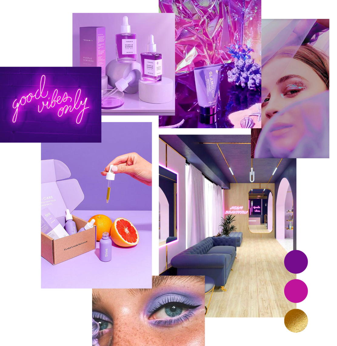
First we define the positioning of the brand and the values.
The goal is to differentiate it from other wellness centers and to be remembered as
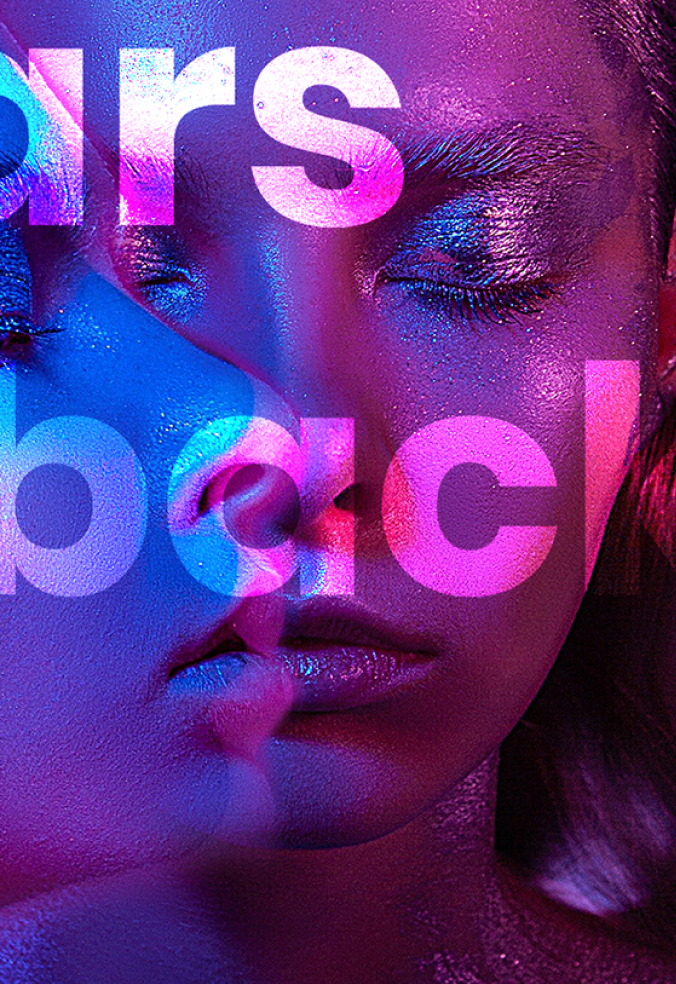
vibrant, youthful and gritty brand.

After defining the visual mood, we design the logo basing it on the main values.
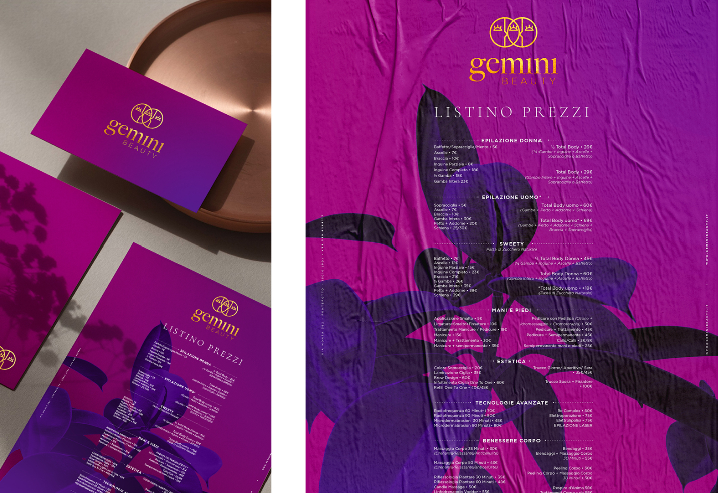
In this step we also define the main fonts and colors.


The main colors want to evoke a modern, sophisticated, minimal and feminine mood.
The mark represents a double faced gemini symbol, but also the connection between the client and the beautician.

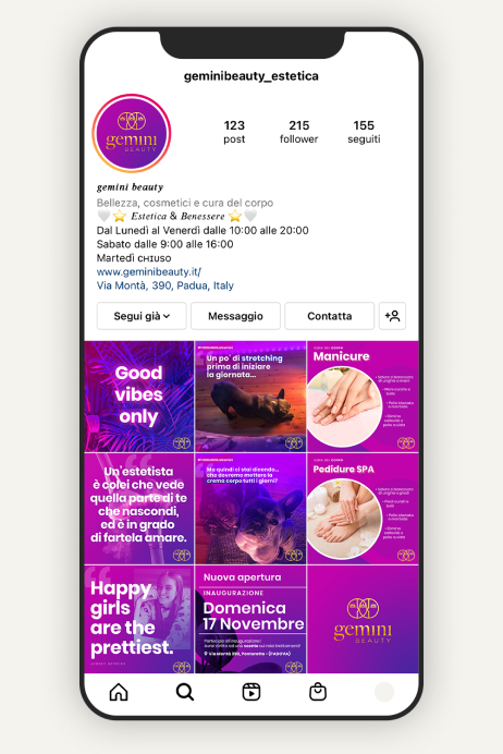
Vibrant colors are recalled both in the collaterals and in the development of promotional designs for social media.


Se vuoi collaborare con noi o hai delle idee ma non sai da dove cominciare, inviaci un messaggio attraverso il modulo di contatto e ti contatteremo al più presto.
In studio realizziamo soluzioni creative per le giovani brand e design moderni per coppie contemporanee.
